CASE STUDY: SISU
From new brand to successful exit, in 2 years
The new owners of SISU Vitamins had a very ambitious goal - a successful exit in 2 years - with no changes to the company, save the brand.
We started behind the 8-ball. There was no consistent logo, no brand graphics, no strategy for advertising or marketing or packaging. Sales depended on pharmacy and vitamin store employees - a precarious position.
A simple brand truth
We found our foundation in the company’s pedigree. SISU is Finnish for inner strength. Our brand would reflect northern European cool, and stoic reserve. Simple, and completely authentic.
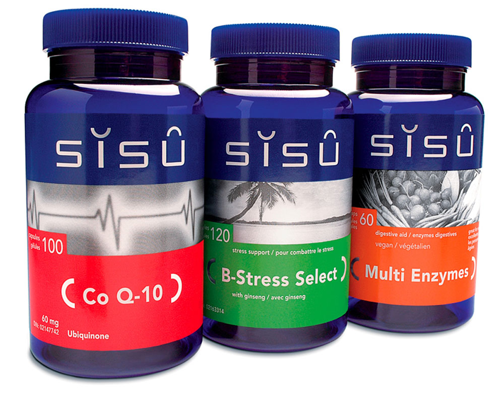
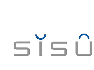
We created a logo that reflected northern cool and subtlety – complete with ‘harmony mark’ umlauts representing two halves of the whole. This was married to new cobalt bottles for the product – completely unheard of in the brown bottle vitamin category.
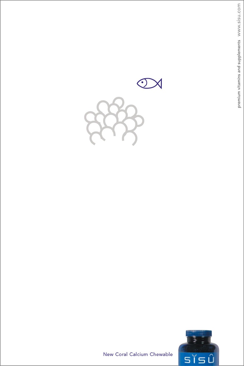
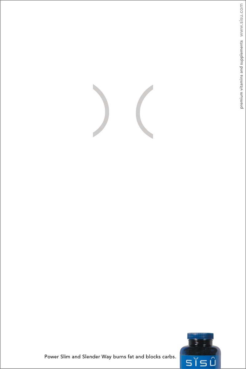
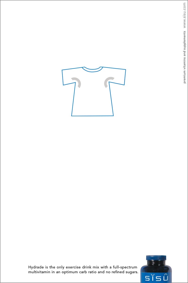
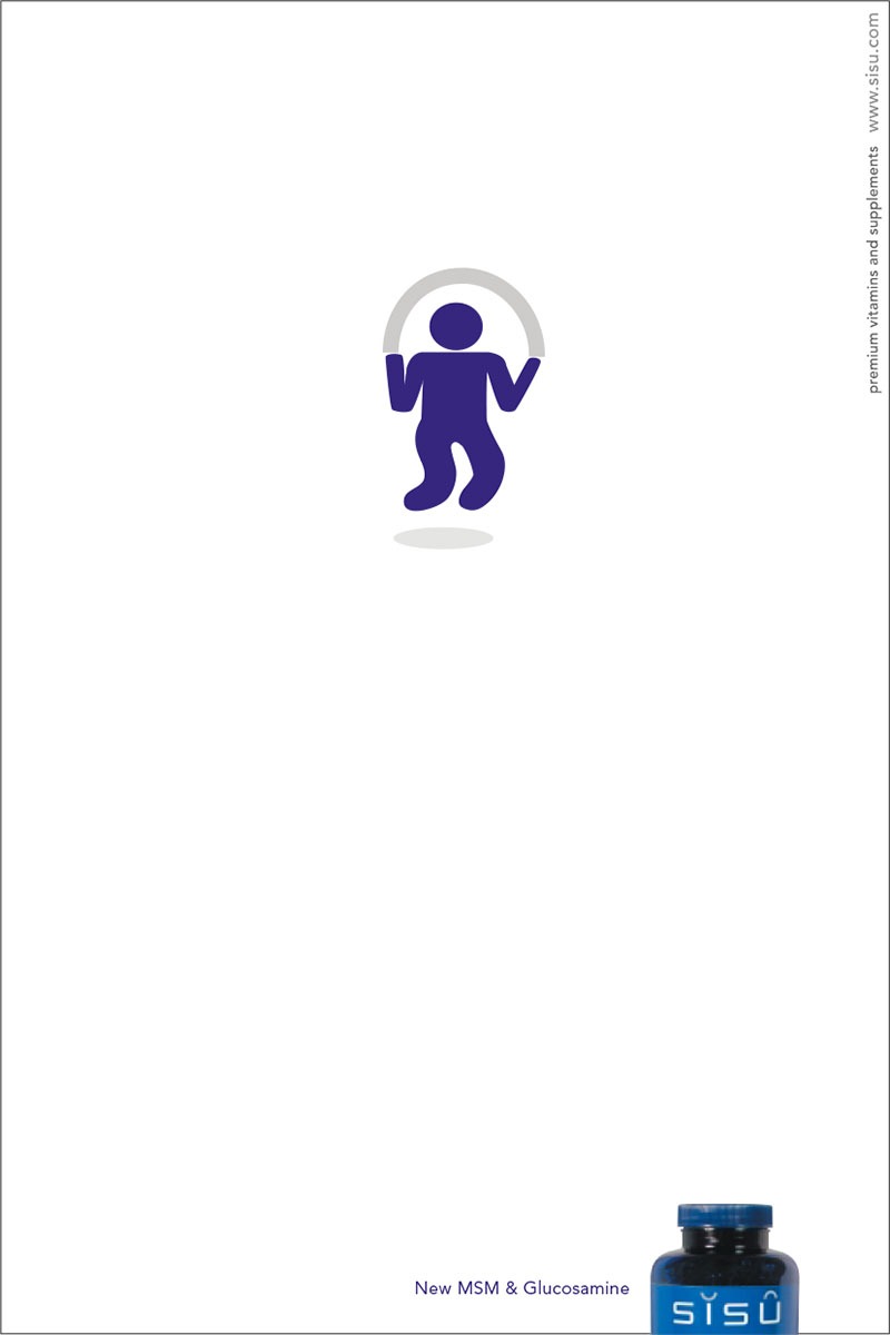
The label on the bottles broke taboos. Vitamins are not allowed to verbalize their health benefit. So we used icons to telegraph these benefits – much like a European brand would in a foreign market. Creating meaning and value without words – simple.
The result
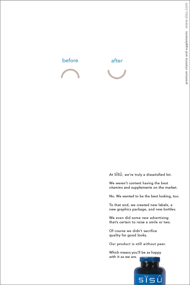
People were drawn to imagery immediately. In fact, it was SISU staff who coined the phrase harmony marks. So we created a multimedia campaign – print, web, online tv, collateral – that played with the harmony marks.
Not only did SISU win virtually every Canadian design award and win a coveted spot in Communication Arts’ Design Annual, but the company sold in two years. On time, and above the exit price.

