When Nathaniel Hawthorne famously said “Easy reading is damn hard writing”, he could’ve been thinking about crafting a simple marketing message.
Why a simple marketing message matters
Every marketing communicator strives for simplicity because complex messages are ignored messages. Consumers are flooded with a firehose of information every day – any message requiring the least bit of effort is just washed away.
And let’s not forget entertainment value. Your messages need to evoke emotion, in addition to being simple. A simple marketing message without sparkle has the memorability of a spreadsheet.
So how do you create an emotional, memorable, simple marketing message? Happily, there’s a template you can follow.
State your key message powerfully. Then stop.
Your key message is the one single point your communication needs to make to succeed.

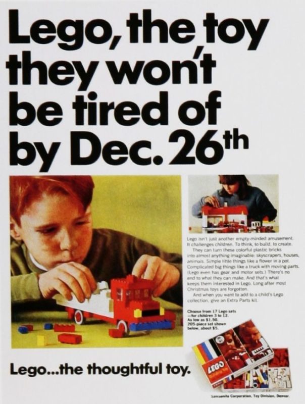
Consider this Lego ad. The key message is Lego never gets boring.
To craft clear communications, you need to express your key message - and then STOP. Share on XThe headline makes the point perfectly.
But there’s more to this ad than a headline. There’s a main visual, an additional ‘filler’ visual, body copy, a product shot, and a tagline.
Do each of these elements make the point as powerfully as the headline? No.
- The main visual is a see / say, meaning it repeats the headline. And for good measure, the filler visual repeats the main visual (I can hear the marketers brainstorming “Hey, if we show one kid happily playing, aren’t two kids happily playing twice as awesome?”)
- The product shot is unnecessary – the first word of the ad is the product name, and you can see the product being used in the main visual.
- The body copy repeats the headline in three paragraphs.
The coup de grace? The tagline “Lego…the thoughtful toy” actually veers off course – giving a conflicting message – mind building instead of unboring.
What we have is an ad with a wonderful key messsage that gets repeated too many times, with a few off-message points thrown in for good measure. Not terribly effective, or memorable.
Use a little french (Neil French, that is)
Neil French inspired me as a budding copywriter in Asia. At the time, French was head of the Ball Partnership, ostensibly the hottest ad agency in the region. One thing that made Ball great was French’s talent for simplification.
How many elements can you strip away from your message until you're just left with the essence? That's the challenge. Share on XFrench’s approach was reductionist by nature. If he started with the Lego ad above, for example, he’d look at elements he could take out without harming the key message.
For example, the tagline. It confuses the unboring message. French would do away with it.
Next is the product shot. Don’t need it, as the first word of the headline is the product name, and the main visual shows the product. Product shot – gone.
Body copy repeats the headline in three paragraphs. Why bother? Gone.
The filler visual? A virtual photocopy of the main visual. Gone.
Now it gets interesting. I personally believe the main visual doesn’t reinforce the unboring message the headline makes. For that reason, French would probably replace it with a visual that does – perhaps a bored clerk at a department store Lego Returns counter?
Or, dare I say, he’d use no visual.
(A simple marketing message needs brilliant placement to succeed. Here’s a story on brand placement.)
The art of the simple marketing message
Reducing a marketing message to just a headline or just a visual sounds a bit heretical. That’s what makes this form of radical simplification so effective.
To prove my point, check out these ads by Neil French.

This one for Chivas Regal simply says “Chivas Regal is like style. If you have to ask what it is, you don’t have it.” No bottle, no lovingly shot glass with Chivas and ice, no suave dude with admiring female companion.
I remember seeing this ad for the first time. It jumped off the page and slapped me. I couldn’t believe anyone could fill an entire newspaper page with, well, nothing.
Truth is, French did fill the page. But instead of cluttering it with visuals and verbal bumpf, he filled it with attitude.
 Now, let’s do a 180, and look at an ad dominated by a visual. (I talk more about the power of a visual brand in this post.)
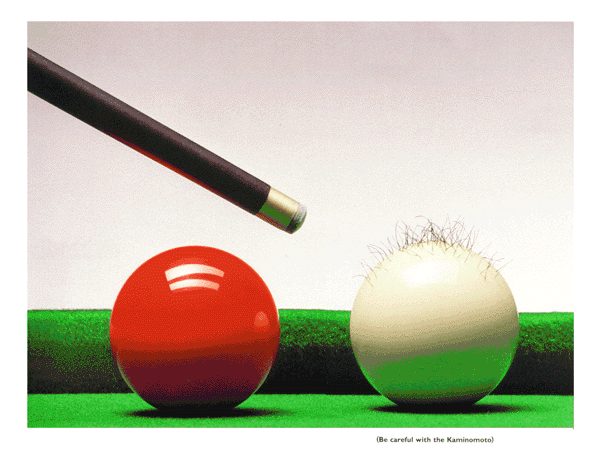
This one is for a hair growth tonic called Kaminomoto. The visual is a cue ball growing hair. The simple, understated line beneath the ball – “Be careful with the Kaminomoto”.
What more do you need to say?
(Simple messaging is great. But you need to properly position your product effectively, too. Here’s the ultimate brand positioning framework.)
How close to one element can you get?
I’ve spent 30 years as a writer trying to get my messages to a level of sublime simplicity. I rarely succeed, but remain undaunted. To me, the challenge of paring away elements until you’re left with something as attention-getting as French’s ads is worth the struggle.
And hey, nobody ever got tired of someone saying less.
Want more stories on crafting a simple marketing message? Check these out:
- The selling power of trusted, familiar ideas
- Ten-ish slides that will define your brand
- The biggest challenges in conducting a brand audit
If you want my latest stories, subscribe to my newsletter below.
Want a great read on how to build your own effective brand? Check out my book BrandDIY.
If you’d like help with your brand, let’s have a chat. Just book a time in my calendar.
And please, don’t forget to share this story!
This post was first published in 2018, but it was updated in 2022 just for you.


