


Alright, I’ll say it – this story on creating effective outdoor advertising is entirely self-serving. I’m writing it is because a partner and I are launching a new outdoor ad offering, putting ads on vending machines. These ads, by their nature, demand a disciplined, stripped back approach to stand out. Enough with the mea culpa – if you’re curious, you can see what I’m talking about here.
Now, on to the public service portion of our post.
We live in a world oversaturated with visual noise. Ads contribute to this noise by the very fact that they exist. That said, it has always been my conviction that if you’re going to be part of the noise, at least make pleasant noise.
Sadly, most ads make a very unpleasant noise. I attribute this to two things:
- Most ads start without an idea. I blame computers, layout templates, stock photo sites, and Steve Jobs’ vision of beautiful fonts in every Mac. It’s simply too easy to create something that’s beautiful, but vapid.
- Most ads – even the ones with ideas – are forced to hold more messages than they should.
I’m not going to address the no idea problem here. But I’m aiming a bazooka at all those ads that have too much stuff in them. Ready, aim…
Ads aren’t pawn shop windows
Have you ever seen one of those store windows absolutely crammed to the rafters with stuff? What do you call those stores?
Pawn shops.
And while they do catch your eye, they don’t generally leave you thinking ‘Hmmm, I wonder what sort of fine, crave-worthy merchandise is contained therein?’ Quite the opposite.
So why do merchants do it? Because they believe if a little merchandise is good, a lotta merchandise is better. And seeing as they paid for that store window, dammit, they’re going to load it up.
I used to start each ad as an empty rectangle drawn on a piece of paper. The challenge was always to put all the important stuff in that empty rectangle, without loading it full of unnecessary stuff.
We knew that the more unnecessary stuff that ad contained, the more it would resemble a pawn shop window. And the less it would sell.
Effective outdoor advertising 101: Strip away elements
Neil French is an absolutely brilliant creative director, and a master of stripping away unnecessary elements from an ad. He has a wonderful exercise in the art of reductionism. I’ll show it to you here.
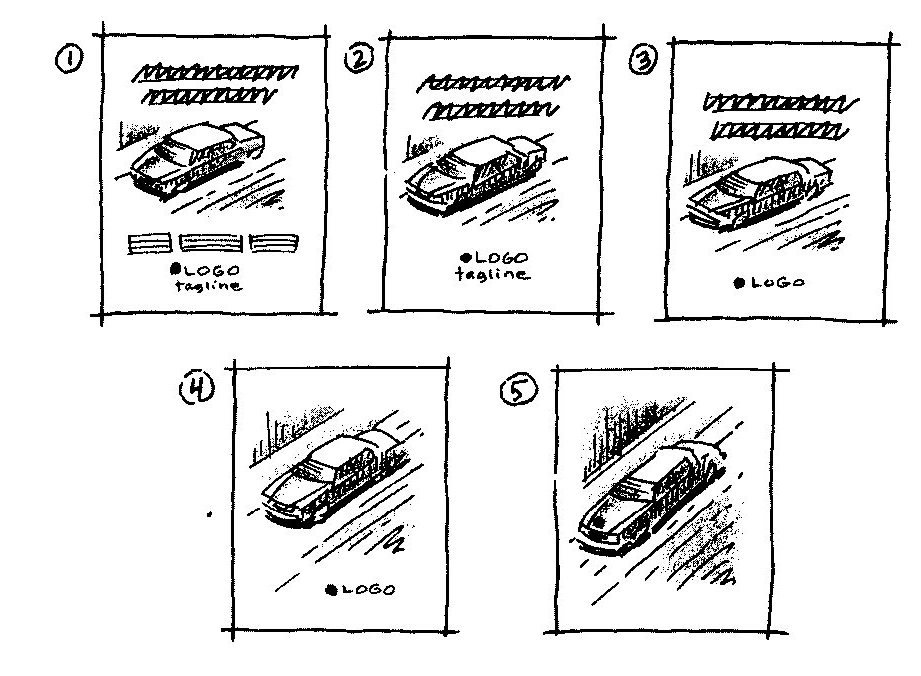
The first little sketch you see (#1 at top left) is a typical ad: headline, visual, bodycopy, logo and tagline.
Now, could that ad work if you pulled one of the elements out of it? Say, the bodycopy? Sure, if the headline effectively conveyed the message, you wouldn’t need more words. Ta-daaa, sketch #2.
What about the tagline? Is it bringing any new information to the ad? Nope? Then broom it and, voila, you have sketch #3.
But do you even need a headline? Not if your visual is smart, and can capture your idea. Hello, #4.
Ultimately, the goal is to get your ad down to one element, as you can see in #5. A visual, or a headline, or bodycopy, or a logo, or a tagline. The more you add, the less people take away.
Can’t be done, you say? Wrong you are.
Here’s an absolutely brilliant ad – outdoor, no less – that incorporates just one element – a logo with a twist. It was done to celebrate Women’s Day.
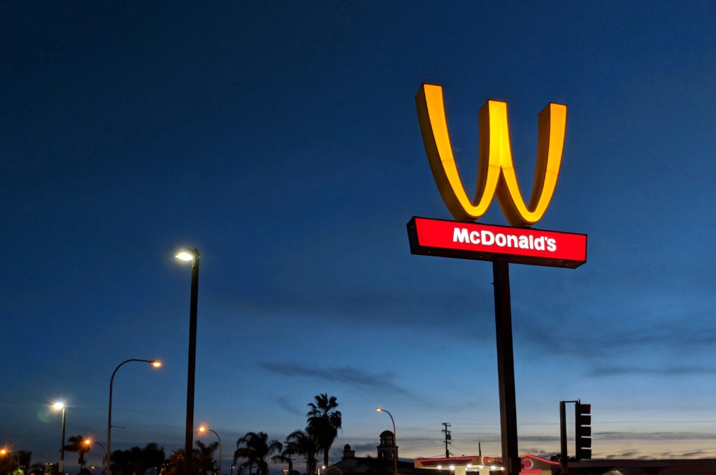
Sure, purists may argue this sign defiles the golden arches. Pffft! I personally recall working on the McDonald’s account, with some of the best brand stewards in the business. They loved giving the arches a tweak, because they knew tweaking their universally recognized logo would create massive disruption, chatter, and positive attention. We turned the arches into missing front teeth to celebrate hockey sponsorships, and other McDonald’s creatives I know turned them into direction arrows on roadsigns, even shark fins.
Can you create effective outdoor advertising? Try this.
As I mentioned right off the top, I’m launching a new media venture putting ads on vending machines. The ads we’re placing initially will be long, skinny ones (about the length of the top of a machine – 36 inches) shaped like this.
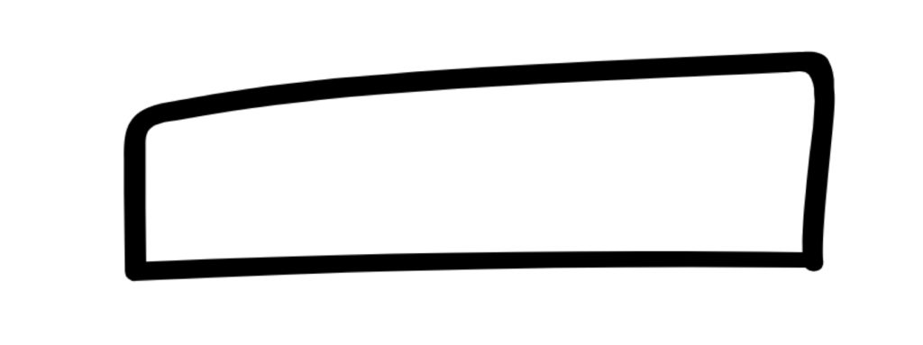
My challenge to you is, can you create an ad for a brand – your brand, a famous brand, any brand – that works in this space as effectively as the McDonald’s W? Two elements or less. Headline and visual. Or maybe just a visual?
If you can, send a sketch. I’ll happily put it in a follow up post, with full credit and a trip for two to Monte Carlo. Kidding about the trip. But serious about running your idea here.
Surprise me.
Addendum – great ads my readers sent in
Within 24 hours of posting this story, Jim Diorio took me up on the challenge above, and sent me this great ad.
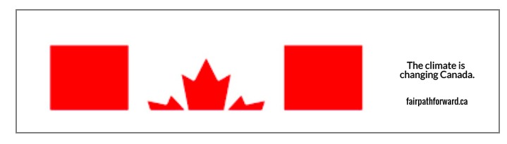
According to Jim, this is an ad done for a real client of his which was – sadly – passed over. Brilliant piece of work. And just 3 elements – visual, headline, and website.
Liked this story? Here are a few more you’ll enjoy:
Want to build a more effective, lean brand? Start by reading my new book BrandDIY.
Sign up for my newsletter below, to my insights straight to your inbox.
And finally, if you enjoyed this post, share it on social media!